
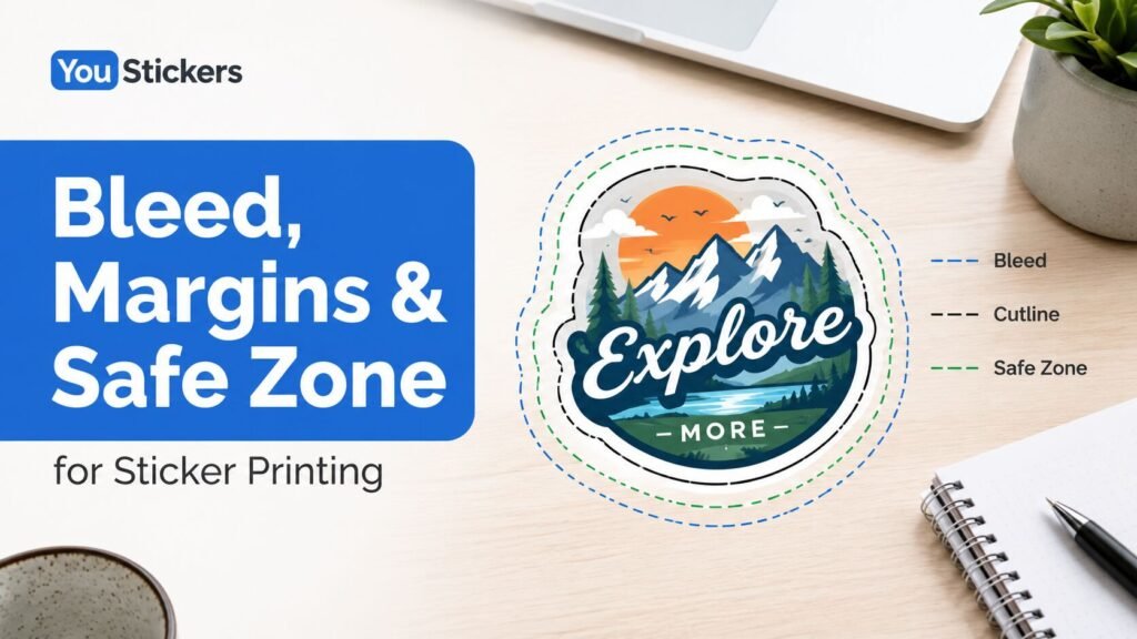
TLDR
- Bleed is extra artwork that extends past the cut edge so the design can print all the way to the sticker edge.
- Margins are the space between important design elements and the sticker edge.
- Safe zone is the protected area where text, logos, QR codes, faces, and important details should stay.
- Keep backgrounds and edge-to-edge colors extended past the cutline, but keep important content pulled inward.
- Thin borders are risky because even small cutting shifts can make one side look uneven.
- A proof helps confirm the cutline, border, and placement before printing, but clean artwork setup makes the proofing process easier.
Why Bleed, Margins, and Safe Zone Matter
Bleed, margins, and safe zone are the parts of a sticker file that help your design survive the real-world cutting process.
On a screen, artwork can look perfectly centered and exact. In production, stickers are printed and cut as physical objects. Tiny shifts can happen during cutting, especially on small stickers, detailed shapes, circles, ovals, sticker sheets, and designs with thin borders. YouStickers’ quality standards explain that minor cutting tolerance can include slight border thickness variation or minor cut drift, while file issues such as cutlines or borders being too thin or too close to the edge are considered customer-provided file issues rather than production defects.
That is why good sticker artwork needs three zones:
- Bleed outside the cut edge
- Trim or cutline where the sticker will be cut
- Safe zone inside the cut edge
If those zones are set up well, your sticker is much less likely to have clipped text, uneven borders, white slivers, awkward edges, or important details too close to the cut.
The Simple Difference Between Bleed, Margins, and Safe Zone
Think of a sticker file like a target.
The cutline is the final sticker edge. This is where the sticker is intended to be cut.
The bleed is the extra artwork outside that cutline. It gives the design a little extra room so background colors, photos, or patterns can reach the edge cleanly.
The safe zone is inside the cutline. This is where important content should stay.
The margin is the space between important content and the cutline. In practice, the margin is what keeps text, logos, and details safely inside the safe zone.
Avery’s bleed and safe area guide describes the cut line as the edge of the label or card, the inner dashed line as the safety area where text and images should stay, and the outer dotted line as the bleed line where full-bleed artwork should extend.
What Is Bleed in Sticker Printing?
Bleed is extra artwork that extends beyond the final cut edge.
If your sticker has a white border and no background color reaching the edge, bleed may not matter as much. But if your design has a background color, full photo, pattern, texture, or shape that should run all the way to the edge, bleed is important.
Without bleed, a tiny cutting shift can expose an unwanted white edge or blank sliver.
Use bleed when your sticker has:
- a colored background
- a photo background
- a pattern
- a texture
- a full-edge shape
- a border color that reaches the edge
- artwork that should print edge to edge
Adobe defines bleed as artwork that falls outside the crop area or trim marks, used as a margin of error so ink can still reach the edge after trimming.
For stickers, the practical rule is simple: anything that should reach the edge should extend past the cutline.
What Is a Safe Zone?
The safe zone is the inside area where important content should stay.
If bleed protects the outside edge, the safe zone protects the inside content. Text, logos, faces, QR codes, barcodes, small icons, contact information, and important design details should not sit right against the cutline.
Keep these inside the safe zone:
- brand names
- logos
- phone numbers
- website URLs
- social handles
- QR codes
- barcodes
- product names
- faces
- character details
- small text
- important outlines
- labels or captions
YouStickers recommends keeping important text and logos away from edges and allowing for cut tolerance. It also recommends 300 DPI at final print size, vector formats such as PDF, SVG, or AI for crisp logos and text, and converting text to outlines or embedding fonts when possible.
What Are Margins?
Margins are the breathing room between important content and the sticker edge.
A margin is not just empty space. It is protection. It helps keep your design from feeling cramped and helps prevent important details from being trimmed or visually crowded.
Good sticker margins are especially important for:
- small stickers
- circles and ovals
- detailed die cut shapes
- sticker sheets
- labels with text
- QR code stickers
- designs with borders
- product packaging labels
- custom shapes with tight corners
A design can technically fit inside the sticker shape and still look wrong if the margins are too tight. Text pressed against the edge can feel accidental. A logo too close to the cutline can look crowded. A QR code near the edge can be harder to scan or easier to damage.
How Much Bleed and Safe Zone Do Stickers Need?
Exact bleed and safe zone requirements can vary by printer, sticker type, material, size, and production method. Always follow the template or proofing instructions for the product you are ordering.
As a general print reference, Avery recommends a bleed of 1/8 inch over the edge for many templates and advises keeping important items such as logos well inside the label bounds. Avery’s roll label artwork guidelines give a smaller production-specific example: 1/16 inch outside the trim line as bleed, 1/16 inch inside the trim line as a safe area, and borders at least 3/16 inch thick for more consistent edge printing.
For custom stickers, the safest practical approach is:
- Extend background artwork past the cutline.
- Keep important content comfortably inside the cutline.
- Avoid thin borders near the edge.
- Review the proof carefully before approval.
YouStickers’ proof process is helpful here because the proof confirms layout, cutline or border, and overall placement before production. On YouStickers custom sticker orders, the team creates the cut line and sends a free online proof before production, so customers can request revisions during proofing.
Bleed vs White Border
A white border can make sticker setup easier because it gives the cutline room to breathe.
If your design is a logo, mascot, illustration, or badge, a white border often looks cleaner than trying to cut extremely close to the artwork. It also makes small cutting shifts less obvious.
Use a white border when:
- the design has a custom shape
- the artwork has detailed edges
- the sticker is small
- the design has no full background
- you want easier peeling
- you want the sticker to feel like a traditional die cut sticker
Use full bleed when:
- the background should go to the edge
- the sticker is a full-color label
- the design is a photo
- the artwork has a pattern or texture
- you do not want any white edge
Neither option is always better. A white border is often safer for custom die cut artwork. Full bleed is better when the sticker should look like the color or image runs off the edge.
Why Thin Borders Are Risky
Thin borders are one of the most common sticker design problems.
A thin border may look even on your screen, but the cut can shift slightly during production. If the border is too thin, a tiny shift can make the sticker look uneven, with one side thicker and another side thinner.
This is especially noticeable on:
- circle stickers
- oval stickers
- square labels
- rectangle labels
- symmetrical logos
- badge designs
- product labels
- small stickers
- sticker sheets
If you want a colored border, make it thick enough to handle normal cutting variation. Avery’s roll label guidelines recommend borders at least 3/16 inch thick for consistent printing around label edges.
For many designs, a thicker white border is more forgiving than a thin printed border.
Safe Zone for Text, Logos, and QR Codes
Text and QR codes need more protection than decorative artwork.
A tiny flower near the edge may still look fine if it shifts slightly. A phone number, website, product name, or QR code can become a real problem if it is too close to the cut.
For text:
- keep it inside the safe zone
- use readable font sizes
- avoid thin script fonts at small sizes
- avoid placing text directly on complex backgrounds
- make sure contrast is strong
For QR codes:
- keep the code away from the cutline
- leave quiet space around it
- avoid distortion
- keep it high contrast
- test the code at final printed size
- do not place it over a busy background
If the sticker’s main purpose depends on scanning or reading, safe zone matters more than squeezing in extra decoration.
How This Changes for Sticker Sheets
Sticker sheets need extra spacing because there are multiple cutlines on one backing sheet.
Each individual sticker on the sheet needs enough room around it so it can be cut and peeled cleanly. If designs are packed too closely, the sheet can feel crowded and harder to use.
For sticker sheets, watch for:
- enough space between individual stickers
- no tiny cut gaps
- no thin slivers of material
- safe zones inside each sticker shape
- enough outer margin around the full sheet
- readable text at the final size
- simple shapes that peel easily
Sticker sheets are a great format, but they require more layout discipline than one large single sticker.
How This Changes for Product Labels
Product labels often need more careful safe zones because they may include required or functional information.
A candle label, jar label, bottle label, ingredient label, barcode label, or QR code label may include text that must stay readable. If that information is too close to the trim edge, the label can look unprofessional or become harder to use.
For packaging labels, keep these safely inside the cutline:
- product name
- scent or flavor
- net weight
- ingredients
- warnings
- barcode
- QR code
- website
- batch or date information
- brand logo
For repeated packaging application, custom labels and roll labels may be a better fit than individual stickers because roll labels are easier to apply in batches.
Common Mistakes to Avoid
Stopping the Background at the Cutline
If the background ends exactly at the cutline, a small cutting shift can leave a white sliver. Extend the background past the cutline when the design should print edge to edge.
Putting Text Too Close to the Edge
Text needs breathing room. Keep names, numbers, labels, and instructions inside the safe zone.
Using a Thin Border
Thin borders can look uneven after cutting. Use a thicker border or a white border when possible.
Forgetting That Small Stickers Need Bigger Visual Margins
The smaller the sticker, the more cramped tight margins can feel. Small stickers need simple layouts and clear spacing.
Treating the Proof Like a Formality
The proof is where you confirm the shape, cutline, border, and placement. Do not approve it until the edge setup looks right.
Using Low-Resolution Artwork
Even perfect margins will not fix a blurry file. Start with clean, high-resolution artwork whenever possible. YouStickers recommends 300 DPI at final print size for raster artwork.
Practical Recommendation
For most sticker files, use this setup:
- Extend background colors, photos, and patterns past the cutline.
- Keep important text, logos, QR codes, and faces comfortably inside the safe zone.
- Avoid thin borders near the sticker edge.
- Use a white border when a custom-shaped design needs more forgiveness.
- Review the proof carefully before approval.
If you are unsure, choose a simpler cut shape, slightly larger margins, and a thicker border. A sticker with room to breathe usually prints cleaner than a design that pushes every element to the edge.
FAQs
What is bleed for stickers?
Bleed is extra artwork that extends past the final cut edge. It helps prevent unwanted white edges when a background color, photo, or pattern is supposed to print all the way to the edge.
What is the safe zone on a sticker?
The safe zone is the inner area where important text, logos, QR codes, and design details should stay. Keeping important content inside the safe zone helps prevent clipping and crowded edges.
Are margins and safe zones the same thing?
They are related but not exactly the same. The safe zone is the recommended protected area inside the cutline. The margin is the space between important content and the sticker edge.
Do I need bleed if my sticker has a white border?
Not usually in the same way. If the white border is part of the design and the cut stays inside or around that border, the border itself gives the cut more room. Bleed matters more when printed color or artwork needs to reach the edge.
Why are thin borders bad for stickers?
Thin borders can look uneven if the cut shifts slightly. A thicker border or white border is usually more forgiving.
Will YouStickers make the cutline for me?
Yes. For custom stickers, YouStickers says the team creates the cut line and sends a free online proof before production. You can also include a vector cutline if you want more control over the shape.
