
TLDR
- A print-ready sticker file should include high-resolution artwork, enough bleed, safe margins, and a clear plan for the cutline.
- Keep important text, logos, faces, borders, and QR codes away from the edge of the sticker.
- Use 300 DPI at final print size for raster artwork whenever possible. YouStickers recommends 300 DPI at final print size, with PNG, JPG, PDF, SVG, and AI as common file options. (youstickers.com)
- Vector files such as PDF, SVG, or AI are usually best for logos, clean text, icons, and crisp shapes.
- A proof helps confirm the layout, cutline, border, and overall placement before printing, but the best results start with clean artwork.
Why Print-Ready Sticker Files Matter
A sticker can only print as cleanly as the file allows. If the artwork is low resolution, missing bleed, too close to the edge, or unclear about where it should be cut, the proofing process may take longer and the finished sticker may not look the way you imagined.
The good news is that most sticker file problems are preventable. You do not need to be a professional designer to prepare better artwork. You just need to understand a few print terms: cutlines, bleed, margins, resolution, and safe zones.
This print-ready sticker file checklist is meant to help you upload a cleaner file, review your proof with more confidence, and avoid common issues like fuzzy artwork, clipped text, uneven borders, and awkward cut shapes.
YouStickers creates a proof before production so customers can review the setup, shape, and overall look before printing. The YouStickers homepage explains that customers upload artwork, review a free online proof, and approve the order before production. (youstickers.com)
Quick Print-Ready Sticker File Checklist
Before uploading your sticker artwork, check these items:
- Artwork is sized to the final sticker size or larger.
- Raster artwork is 300 DPI at final print size when possible.
- Text is readable at the actual sticker size.
- Important details are inside the safe zone.
- Backgrounds or colors that reach the edge include bleed.
- The cutline is clear or the desired shape is easy to understand.
- Borders are thick enough to cut consistently.
- Transparent areas are actually transparent, not white.
- Fonts are outlined, embedded, or converted when possible.
- Logos and text are vector when possible.
- QR codes are large enough to scan and not too close to the edge.
- The file is saved in a useful format such as PNG, JPG, PDF, SVG, or AI.
- The proof is reviewed carefully before approval.
What Is a Cutline?
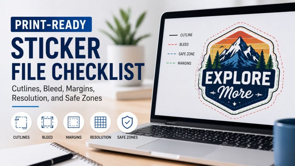
A cutline is the path that shows where the sticker will be cut.
For a circle sticker, the cutline is a circle. For a square sticker, it is a square. For a custom die cut sticker, the cutline follows the shape of the artwork. For kiss cut stickers or sticker sheets, the cutline may cut through the sticker layer while leaving the backing sheet intact.
A cutline matters because stickers are physical products. The printer does not just print the design; the sticker also has to be cut into a usable shape.
A good cutline should be:
- smooth
- simple enough to cut cleanly
- not too tight around delicate artwork
- not cutting through important details
- not creating tiny fragile points
- not creating awkward slivers or sharp interior corners
If you already know exactly where the sticker should be cut, include a cutline in the file. If you do not know how to build one, upload the best artwork you have and explain the intended shape when ordering. YouStickers notes that customers can upload artwork with die-cut lines for custom bumper sticker shapes, which is a helpful example of how a cutline can guide the final shape. (youstickers.com)
Die Cut vs Kiss Cut: Why the Cut Style Changes the File
A die cut sticker is cut through the sticker material and backing, creating an individual sticker in the shape of the design.
A kiss cut sticker is cut through the sticker layer but not all the way through the backing. This leaves extra backing around the sticker, which can make it easier to peel and protect delicate shapes.
YouStickers explains the difference in its die cut vs kiss cut stickers guide. Kiss cut is especially useful for sticker sheets or detailed shapes because the extra backing can make the sticker easier to handle. (youstickers.com)
Use die cut when the final sticker shape should follow the artwork as a finished individual piece. Use kiss cut when you want easier peeling, multiple stickers on one sheet, or more backing around a delicate design.
What Is Bleed?
Bleed is extra artwork that extends beyond the final cut edge.
If your design has a background color, pattern, photo, or shape that should go all the way to the sticker edge, that artwork needs to extend past the cutline. This extra area gives the cutter a small margin of error, so the finished sticker does not end up with a thin white edge where the artwork stopped too soon.
Adobe describes bleed as the amount of artwork that falls outside the crop or trim area, used as a margin of error to help ensure the printed image reaches the edge after trimming. (adobe.com)
For sticker artwork, bleed is especially important when:
- the background goes to the edge
- the artwork has a full-color border
- the design includes a photo
- the sticker is a custom shape
- the design has a pattern
- the edge color needs to look clean after cutting
Avery’s bleed and safe area guide explains that the bleed line sits outside the cut line, and that background images or colors for print-to-edge products should extend to the bleed line or beyond. (avery.com)
What Is a Safe Zone?
The safe zone is the area inside the cutline where important content should stay.
If bleed is the extra artwork outside the cut, the safe zone is the protected area inside the cut. Text, logos, faces, QR codes, borders, and important design details should stay inside this area so they are not trimmed too close to the edge.
Avery explains that the safety area is the inner area where text and images should stay so they are not cut off. (avery.com)
For sticker files, keep these inside the safe zone:
- text
- logos
- faces
- thin outlines
- important illustration details
- QR codes
- barcodes
- phone numbers
- website URLs
- social handles
- product names
- warning or instruction copy
If something is important, do not place it right against the edge.
Margins vs Safe Zones: Are They the Same Thing?
Margins and safe zones are closely related, but they are not exactly the same.
A margin is the space between important artwork and the edge of the sticker. The safe zone is the recommended area where important artwork should stay. In everyday sticker setup, people often use these terms together because both are about keeping content away from the cut.
A good sticker margin helps prevent:
- clipped text
- uneven borders
- awkward cuts
- logos too close to the edge
- QR codes that are hard to scan
- thin outlines disappearing
- important details looking cramped
YouStickers’ quality standards recommend keeping important text and logos away from edges and allowing for cut tolerance. (youstickers.com)
A simple rule: the smaller the sticker, the more careful you need to be with margins.
Why Thin Borders Can Be Risky
Thin borders are one of the most common sticker file problems.
A border may look perfectly even on screen, but stickers are cut by a machine, and every physical cutting process has some tolerance. If the border is very thin, even a tiny shift can make one side look thicker than the other.
Thin borders are especially risky on:
- circles
- ovals
- rounded rectangles
- small stickers
- sticker sheets
- labels with tight frames
- designs with a colored outline near the edge
- designs where symmetry matters
If you want a border, make it thick enough to survive normal cutting variation. Avery’s roll label artwork guidelines recommend keeping borders thick and important content inside the safety line for consistent results. (avery.com)
For many custom stickers, a white border around the design is safer than a thin printed border. A white border gives the cutline room to breathe and makes small shifts less noticeable.
What Resolution Should Sticker Files Be?
For raster artwork, aim for 300 DPI at the final print size.
Raster artwork includes pixel-based files such as photos, screenshots, JPGs, PNGs, and artwork exported from drawing apps. These files can print beautifully when they have enough pixels, but they can look blurry or jagged if enlarged too much.
YouStickers recommends 300 DPI at final print size in its file requirements. (youstickers.com) Adobe also describes 300 PPI as an industry standard for high-quality prints viewed up close. (adobe.com)
The important phrase is at final print size.
A 1000-pixel image might look fine as a small sticker but blurry as a large sticker. The same file can be acceptable at one size and too low resolution at another.
For example:
| Final Sticker Size | Recommended Raster Size at 300 DPI |
|---|---|
| 2 in × 2 in | 600 px × 600 px |
| 3 in × 3 in | 900 px × 900 px |
| 4 in × 4 in | 1200 px × 1200 px |
| 5 in × 5 in | 1500 px × 1500 px |
This does not mean every file must be a square. It means the pixel dimensions should support the final printed size.
Raster vs Vector Files
A raster file is made of pixels. A vector file is made of paths and shapes.
Raster files are common for:
- photos
- hand-drawn artwork
- Procreate art
- Photoshop files
- scanned art
- detailed illustrations
- textured designs
Vector files are common for:
- logos
- icons
- text
- simple illustrations
- badges
- line art
- geometric shapes
- clean brand marks
Vector files are usually better for crisp logos and text because they can scale without becoming pixelated. YouStickers lists PDF, SVG, and AI as vector formats that are best for logos and crisp text. (youstickers.com)
Use raster when the artwork is a painting, photo, or detailed illustration. Use vector when the artwork is a logo, type-based design, icon, or clean shape.
Best File Types for Sticker Printing
The best file type depends on the artwork.
PNG
PNG is a good choice for artwork with transparency. Use PNG when the background should be removed and the sticker should follow the design shape.
JPG
JPG can work for full-background artwork, photos, and designs that do not need transparency. Avoid overly compressed JPGs because compression can create blocky artifacts.
PDF is often a strong choice for print-ready files, especially when it preserves vector artwork, text, and layout. It can also be useful when a cutline is included.
SVG
SVG is useful for clean vector graphics, icons, and logos. It is not always the best format for complex print layouts, but it can be excellent for simple shapes and scalable artwork.
AI
AI is Adobe Illustrator’s native vector format. It is useful for logos, cutlines, outlined fonts, and clean production files.
YouStickers lists PNG, JPG, PDF, AI, and SVG as upload file types on its homepage workflow. (youstickers.com)
Transparent Backgrounds: What to Check
A transparent background means there is no background behind the artwork. It does not mean the background is white.
This matters for custom-shaped stickers. If your design is supposed to be cut around a logo, mascot, or illustration, the file should not have a white rectangle behind it unless you want that rectangle printed.
Before uploading, check:
- Is the background actually transparent?
- Is there a hidden white box behind the artwork?
- Are there stray pixels around the design?
- Are shadows, glow effects, or soft edges intentional?
- Does the cutline follow the artwork or the full canvas?
A PNG is often the easiest file type when you need transparency, while JPG does not support transparent backgrounds.
Text, Fonts, and Outlines
Fonts can change if the printer does not have the same font installed. To avoid font problems, convert text to outlines or embed the fonts when possible.
YouStickers recommends converting text to outlines or embedding fonts when possible. (youstickers.com)
This is especially important for:
- brand names
- phone numbers
- website URLs
- product names
- ingredient labels
- QR code labels
- event details
- warning labels
- small text on packaging
Also check text size at the final sticker size. A line of text that looks readable on a large monitor may be too small on a 2-inch sticker.
QR Codes and Barcodes
QR codes and barcodes need extra care because they must be readable by a scanner, not just by a person.
For QR code stickers:
- keep the QR code large enough to scan
- keep it high contrast
- avoid placing it over busy backgrounds
- keep it away from the cut edge
- do not distort or stretch it
- test scan it at the final printed size
- leave quiet space around it
For packaging labels, do not sacrifice scan reliability to make the design feel more decorative. A clean black-and-white QR code on a solid background is usually safer than a tiny code placed over artwork.
Color Expectations
Screen color and printed color are not exactly the same.
Screens use light. Printed stickers use ink on a material. The sticker material, laminate, lighting, and color setup can all affect the final look.
YouStickers’ quality standards note that CMYK-friendly colors print most predictably. (youstickers.com) That does not mean every customer must be a color-management expert, but it does mean neon RGB colors, screen-bright blues, and very saturated colors may not print exactly as they appear on a monitor.
If color is critical, mention it before approving the proof.
How to Review Your Sticker Proof
The proof is your chance to catch layout and setup issues before printing.
YouStickers explains that the proof is used to confirm layout, cutline or border, and overall placement, and that once a proof is approved, production is based on that approval. (youstickers.com)
When reviewing a proof, check:
- Is the sticker shape correct?
- Is the cutline where you expected?
- Is the border even enough?
- Is any text too close to the edge?
- Is the artwork centered correctly?
- Is the size correct?
- Are transparent areas handled correctly?
- Are small details readable?
- Are QR codes or barcodes clear?
- Is this the correct file version?
Do not approve the proof until the layout, cutline, and artwork look right.
Common Sticker File Mistakes to Avoid
Uploading a Screenshot
Screenshots are usually low resolution and often include compression, UI elements, or unwanted backgrounds. Use the original artwork whenever possible.
Making the Cutline Too Tight
A cutline that hugs every tiny detail can create fragile points, awkward cuts, or difficult peeling. Give the design room to breathe.
Forgetting Bleed
If artwork stops exactly at the cutline, small cutting variation may reveal a thin unprinted edge. Extend background artwork past the cutline when you want print-to-edge coverage.
Putting Text Too Close to the Edge
Text near the cutline can look cramped or get trimmed. Keep important content inside the safe zone.
Using Thin Borders
Thin borders can look uneven after cutting. Use a thicker border or choose a white border instead.
Enlarging Low-Resolution Art
Changing a file from 72 DPI to 300 DPI does not automatically add real detail. The artwork needs enough actual pixels for the final print size.
Forgetting to Outline Fonts
If fonts are not embedded or outlined, they may change when the file is opened elsewhere. Outline or embed fonts when possible.
Using a White Background by Accident
A white background will usually print as part of the design. If you want a custom shape around the artwork, use transparency or explain the intended cut.
Practical Recommendation
For the cleanest sticker order, upload the highest-quality original artwork you have.
Use PDF, SVG, or AI for logos, text, icons, and clean vector graphics. Use PNG for artwork with transparency. Use JPG only when you do not need transparency and the file is high resolution.
Keep important content away from the cutline, include bleed when artwork should reach the edge, and review the proof carefully before approval. If you are unsure whether the file is print-ready, send the best version you have and include notes about the size, shape, background, and cutline you want.
FAQs
What is the best file type for custom stickers?
PDF, SVG, or AI is usually best for logos, text, and vector artwork. PNG is usually best for transparent raster artwork. JPG can work for full-background designs but does not support transparency.
Do I need to include a cutline?
Include a cutline if you know exactly where the sticker should be cut. If you do not know how to make one, upload your artwork and explain the desired shape so the proof can show the cutline before production.
How much bleed do stickers need?
Bleed requirements can vary by printer and product. The general idea is to extend any background color, photo, or pattern beyond the cutline so small cutting variation does not create an unwanted white edge. Avery’s artwork guidance gives examples of bleed and safety areas for labels, while Adobe explains bleed as artwork outside the trim area. (avery.com, adobe.com)
What does 300 DPI at final size mean?
It means the artwork has enough pixels for the physical size you want to print. For example, a 3-inch sticker should ideally have about 900 pixels across if it is printed at 300 DPI.
Can you print a low-resolution logo?
A low-resolution logo may print, but it can look blurry or pixelated. A vector logo is usually better for clean edges, small text, and professional-looking brand stickers.
What should I check before approving my proof?
Check the size, shape, cutline, border, text placement, transparent background, spelling, QR codes, and overall layout. The proof is your chance to confirm the setup before production.
