
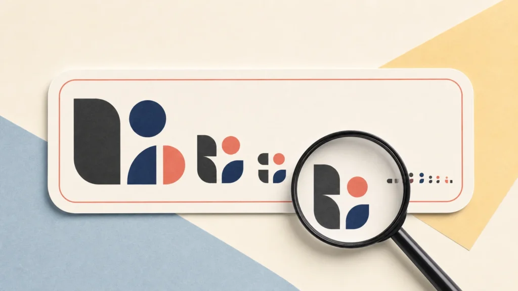
TLDR: There is no universal minimum text size for stickers. A size that works for a bold, high-contrast label may fail in a thin decorative font or on a busy holographic background. Judge text at its final physical size and expected viewing distance. Favor open, sturdy letterforms, strong contrast, adequate spacing, vector text when possible, and safe placement away from the cutline. Review the production proof, and treat QR codes and barcodes as separate technical elements that require final-size scan testing.
The practical answer to “How small can sticker text be?” is not a single point size. The minimum text size for stickers changes with the font, wording, print file, material, finish, viewing conditions, and purpose of the message. Tiny artist credits on a sticker insert have a different job from flavor text on a jar label or a call to action meant to be read at an event.
Start with the finished sticker rather than the zoomed-in design file. Set the artwork to its actual print dimensions, view or print it at 100% scale, and ask whether the intended reader can recognize the message comfortably. YouStickers likewise advises checking readability at the actual sticker size rather than relying on an enlarged screen view.
Why there is no universal minimum text size for stickers
Point size describes the type setting, but it does not guarantee that every font will produce equally large or clear characters. Two fonts set to the same point size can have noticeably different lowercase heights, character widths, counters—the enclosed spaces inside letters—and stroke weights. A compact serif, wide geometric sans serif, and handwritten script can therefore perform very differently in the same area.
Viewing distance also changes the decision. Transport for London’s text legibility standard bases minimum type guidance on expected viewing distance and the format carrying the message. That document is not a sticker-printing specification, but it supports a useful design principle: type cannot be judged independently of where and how it will be read.
For example, a small line identifying an artist may only need to work when someone holds the sticker in hand. A website address on an event giveaway may need to register during a quick glance. Instructions on packaging may need sustained, reliable readability. The more important or time-sensitive the message is, the less sensible it is to push the type toward the smallest possible size.
Evaluate the text at its final physical size
Screen zoom is useful for editing paths, but it can hide readability problems. Text that looks clean at 400% may become a gray blur when reduced to a two-inch sticker. Before ordering, enter the exact finished dimensions and inspect the complete design at actual size. If possible, print a paper mockup without using “fit to page,” then place it where the sticker or label will be used.
- Confirm the final width and height of the sticker, not just the canvas dimensions in pixels.
- View the full design at 100% scale and resist zooming in while judging readability.
- Print a correctly scaled paper mockup when physical context matters.
- Check the mockup at the intended distance and under realistic lighting.
- Ask someone unfamiliar with the design to read it without first telling them what it says.
A mockup from an office printer does not predict final color or print quality. It is still useful for judging hierarchy, crowding, and whether a person can read the wording at the intended size.
Choose letterforms that survive reduction
Small sticker text benefits from clear shapes and enough visual weight to remain distinct after printing. Very thin strokes, extreme thick-to-thin contrast, distressed textures, tightly packed letters, and elaborate scripts can lose definition sooner than a straightforward medium-weight face. The problem is not that decorative fonts are inherently wrong; it is that their defining details may be too fragile at the chosen size.
Look closely at letters that are easily confused, such as lowercase “c” and “e,” or characters with small interior spaces. If counters begin closing up or adjacent strokes appear to merge at actual size, increase the type, choose a sturdier weight, loosen the layout, or shorten the copy. Avoid stretching type to force it into a narrow space because distortion can make familiar letter shapes harder to recognize.
Spacing matters too. Tight tracking can turn separate letters into one dark shape, while cramped line spacing makes multiple lines difficult to follow. TfL’s clear-print guidance considers contrast, spacing, and restrained type styling important to legibility. A short phrase with breathing room usually performs better than a paragraph compressed to fit a small sticker.
Make contrast part of the size decision
Small text needs a clear distinction from its background. Dark lettering on a light, quiet field or light lettering on a dark field is generally easier to resolve than similar colors placed together. Busy illustrations, gradients, textures, and photographs can interrupt letter shapes even when the type seems large enough in isolation.
Do not evaluate contrast from screen color alone. Material, laminate, lighting, and the surface visible behind a clear sticker can change perceived color and contrast. A screen proof also cannot provide a perfect physical color match. On clear or specialty material, consider whether the base effect should show through the letters or whether selected areas need an opaque white underprint. The proof should make that production intent clear.
A practical fix is to give small copy a simple background panel or outline rather than placing it directly over detailed artwork. If the treatment makes the letters look clogged at actual size, simplify it instead of adding more effects.
Use artwork that preserves small details
Vector artwork is usually the safer choice for small logos and type because its paths remain scalable. YouStickers identifies PDF, SVG, and AI as preferable formats for crisp logos and text. Fonts should be outlined or embedded when appropriate so that an unavailable font is not substituted during file handling. The raster versus vector sticker guide explains how the two artwork types behave in print.
Raster text can still print well, but it must contain enough pixels at the final dimensions. YouStickers recommends 300 DPI at final print size when possible. Enlarging a small raster image later does not restore missing edge detail. It only spreads the existing pixels across a larger area, which can leave fine type soft or jagged.
Resolution is not a substitute for good typography. A 300 DPI file can still contain text that is too delicate, poorly contrasted, or too small for its viewing conditions. For a broader preflight process, use the print-ready sticker file checklist before submitting the artwork.
Keep text away from the cutline
Readable type can still fail if it sits too close to the sticker edge. Printing and contour cutting are physical processes, so important text, logos, QR codes, and other critical details should remain inside the designated safe zone rather than depending on exact alignment with the cutline.
The same issue affects thin borders. Normal cutting variation can make a narrow border appear uneven, particularly when it closely follows an irregular contour. Moving critical content inward and using a more forgiving border creates a layout that remains intentional if the cut shifts slightly. The appropriate margin depends on the design and production setup, so use the proof rather than inventing a universal safe-zone measurement.
Treat QR codes and barcodes differently from ordinary text
A person may be able to puzzle out imperfect lettering, but a code must preserve a machine-readable pattern. Do not resize a QR code or retail barcode according to a generic sticker font rule. The symbol type, encoded data, printing method, scanner environment, placement, and required clear space can all affect whether it works.
GS1 US states that barcode size depends on how and where the barcode will be used and how it will be printed. It also calls for high-resolution artwork, suitable contrast, and sufficient clear space around the symbol. Consult the GS1 US barcode placement and printing guidance when preparing retail barcodes.
For any code, keep it away from busy artwork and the cut edge, avoid distortion, and test it at final printed size. YouStickers recommends keeping QR codes and barcodes high contrast, large enough to scan, undistorted, and clear of cut edges. A screen test is helpful but does not replace scanning a correctly sized physical sample when code performance is operationally important.
What to check in the production proof
YouStickers provides an online proof before production so the customer can review layout, cutline, and placement. Treat that proof as a decision point rather than a routine confirmation. Check the finished dimensions, spelling, text hierarchy, cut contour, border consistency, and the distance between critical content and the cutline.
- Can every important line be read at the stated finished size?
- Does the smallest text still have open counters and distinct strokes?
- Is the contrast strong enough without relying on a backlit screen?
- Are fonts outlined or embedded where appropriate?
- Are important words, logos, and codes comfortably inside the safe area?
- Does the proof show the intended white underprint or transparent areas on specialty material?
- Have QR codes or barcodes been tested at final physical size?
Frequently asked questions
Is there a font size that always works for sticker printing?
No. The same point size can look and perform differently across fonts, weights, materials, backgrounds, and viewing distances. Use actual-size inspection and proof review instead of treating one number as a universal production guarantee.
Why do two fonts at the same point size look different?
Fonts have different lowercase heights, widths, stroke proportions, spacing, and internal openings. A sturdy sans serif may remain clear where a delicate script at the same setting becomes difficult to distinguish.
Should small sticker text be vector or raster?
Vector is generally preferable for logos and compact type because it remains scalable and keeps clean paths. Raster text can work when the source is sharp and prepared at sufficient resolution for the final print size. YouStickers recommends 300 DPI at final size when possible for raster artwork.
Does a matte or gloss finish make small text easier to read?
There is no universal winner. Material, laminate, lighting, background color, and viewing angle can change perceived contrast. Choose based on the complete design and use case, then confirm that the smallest text remains distinct in the proof.
Can I use the same size rule for text and a QR code?
No. A QR code or barcode is a machine-readable symbol with clear-space, contrast, sizing, and placement considerations. Follow the applicable code standard and test the symbol at final physical size rather than treating it like a block of lettering.
A practical final recommendation
Do not design toward the smallest theoretically printable text. Design toward the smallest text that remains comfortably readable in the real use case. Set the final dimensions first, inspect the design at actual size, simplify fragile typography, strengthen contrast, preserve file quality, and keep critical details away from the cutline. Then review the proof as a physical-production plan, not merely as a picture of the artwork.
References
- Print-Ready Sticker File Checklist: Cutlines, Bleed, Margins, Resolution, and Safe Zones – YouStickers
- Text legibility standard
- Color Matching – YouStickers
- Bleed, Margins, and Safe Zone for Sticker Printing – YouStickers
- Barcode Placement & Printing Guidelines | GS1 US
- Custom Sticker Printing | Quality Vinyl | YouStickers
