
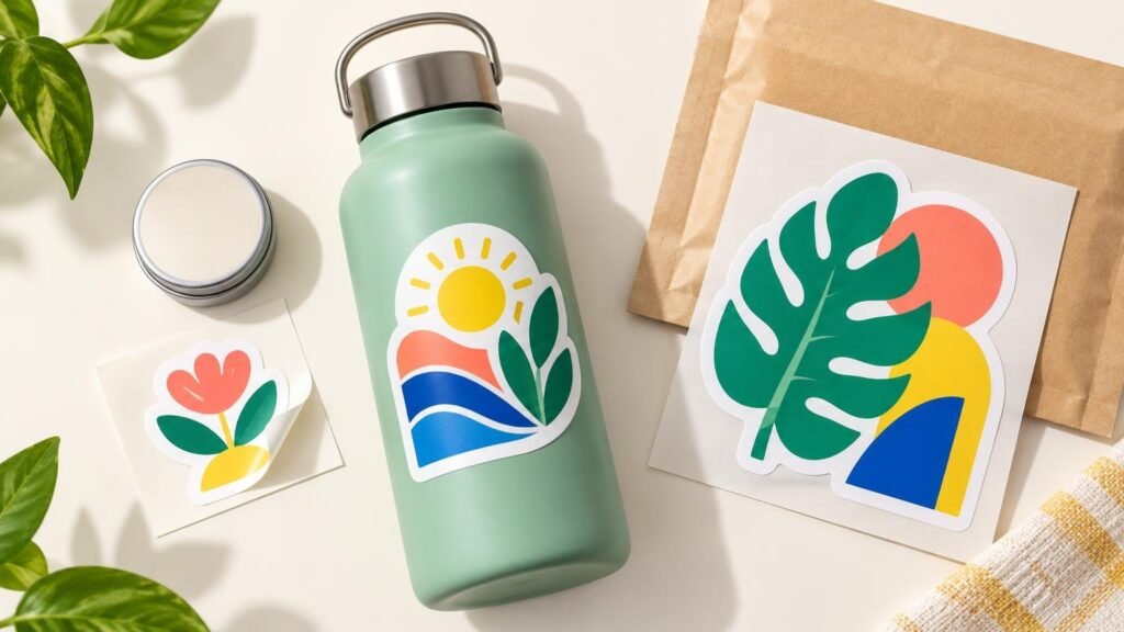
Standard sticker sizes are best understood as common starting points, not fixed industry rules. A 2-inch sticker often suits a simple logo or small giveaway, 3 inches is a versatile middle ground, and 4 inches gives detailed artwork or longer text more room. Rectangle presets are useful for horizontal logos and information-heavy designs. The right choice, however, is the size that fits the real application surface without making the artwork cramped or visually lost.
When comparing standard sticker sizes, start with three questions: Where will the sticker go? How much information must remain readable? What shape naturally fits the artwork? Measure the usable surface first, view the design at its intended physical size, and treat the digital proof as the final checkpoint for dimensions, cut shape, margins, and visual balance.
Common sticker sizes at a glance
The dimensions below are practical reference points rather than universal standards. YouStickers’ sizing guidance presents 2 inches for smaller or simpler uses, 3 inches as a general-purpose option, and 4 inches for artwork that needs more room for detail. Its rectangle-sticker page currently lists 3 × 1, 3 × 2, 4 × 2, and 5 × 3 inches as preset choices. Product configurations can change, so confirm the current selector before building artwork around a particular preset.
| Common size | Good starting point for | Watch for |
|---|---|---|
| 2 inches | Simple logos, icons, seals, small handouts | Fine text and detailed illustrations can become difficult to read |
| 3 inches | Laptop stickers, creator merchandise, giveaways, general branding | May be too large for compact packaging or too small for dense copy |
| 4 inches | Detailed artwork, larger promotional stickers, bold display graphics | Can dominate small containers, boxes, or devices |
| 3 × 1 or 3 × 2 inches | Horizontal logos, short messages, URLs, compact package panels | Long copy may still feel crowded |
| 4 × 2 or 5 × 3 inches | Larger rectangular graphics and information-led layouts | Check corners, curved surfaces, and available flat space |
A quoted size normally describes the overall finished dimensions, not the amount of space available for every design element. A 3-inch circle, for example, has less usable room near its corners than a 3-inch square. A 3-inch-wide die cut may also have narrow projections or irregular edges that reduce the safe visual area for text.
How to choose between 2-inch, 3-inch, and 4-inch stickers
Choose 2 inches for simple, compact designs
A 2-inch sticker is a sensible starting point for a logo, monogram, simple mascot head, package seal, or small giveaway. It works best when the design has one clear focal point and very little supporting text. If the artwork includes a slogan, social handle, border, and small legal line, two inches can disappear quickly.
Judge the design at actual size rather than by zooming in on a monitor. Print a paper mockup at 100% scale, cut it out, and place it on the intended object. This low-cost check often reveals that a border feels too heavy, a wordmark is too small, or the sticker covers more packaging than expected.
Choose 3 inches for an adaptable general-purpose sticker
Three inches is often the easiest starting point for promotional stickers, laptop graphics, illustrated merchandise, and medium-size branding. It provides more breathing room than a 2-inch format without becoming oversized for many everyday applications. That does not make it universally correct: a three-inch circle may overwhelm a small jar, while a three-inch-wide rectangle could fit its front panel neatly.
Choose 4 inches when detail or viewing distance matters
A 4-inch sticker gives illustrations, multiple words, and layered artwork more physical room. It can work well on larger boxes, cases, vehicle windows, display boards, and promotional items viewed from farther away. Before increasing the size, confirm that the source artwork can support the larger output. Enlarging a low-resolution raster file does not create missing detail.
Match the shape to the content
Size and shape should be chosen together. A circle or square provides a compact, balanced field for an icon, badge, or centered logo. A rectangle is usually more efficient for horizontal wordmarks, short instructions, ingredients, web addresses, QR codes, or barcodes. YouStickers specifically positions its rectangle stickers for text and scan-dependent elements such as QR codes and barcodes. Any code that matters operationally should be printed and tested at the intended physical size rather than trusted solely from an enlarged screen preview.
A custom die cut follows the artwork’s contour and can make a character, product silhouette, or unusual logo feel intentional. It may also create tight areas where small text or thin borders become awkward. YouStickers says it supports standard shapes and custom sizes and shapes, with cutlines reviewed through online proofing. This same sizing process applies when evaluating other custom sticker printing options: measure the placement area, preserve the design’s natural proportions, and inspect the proposed cutline before production.
Measure the surface, not just the object
A bottle may be six inches tall, but its usable label panel could be much smaller because of shoulders, seams, ridges, or a tapered body. A mailer may have plenty of total area but limited clean space after the shipping label and closure flap are considered. Measure only the flat, unobstructed region where the adhesive will make consistent contact.
- Identify the exact placement area, including curves, seams, handles, closures, and existing labels.
- Measure the usable width and height with a ruler or flexible tape.
- Reduce the proposed dimensions if the sticker would run into a sharp curve or packaging edge.
- Create a paper mockup at the exact finished size and place it on the object.
- Check the design from its normal viewing distance, not only from a few inches away.
For jars, bottles, pouches, and retail boxes, the delivery format also matters. Individually cut stickers can suit occasional hand application or promotional inserts. Repeated packaging work may be better served by rolls or sheets, depending on order volume and how the labels are applied. The comparison in roll labels versus sticker sheets for packaging explains how format affects the application workflow.
Use custom dimensions when presets fight the artwork
A preset is convenient when it fits both the surface and the artwork’s natural proportions. Do not force a wide logo into a square just because a square size appears familiar. The result may contain excessive empty space, or the logo may need to shrink until it loses impact. Likewise, cropping a tall illustration into a circle can remove details that define the design.
Custom dimensions are worth considering when the available panel is unusual, the artwork has a distinctive aspect ratio, or the sticker must align with a packaging feature. YouStickers’ FAQ advises buyers who are unsure about die-cut dimensions to estimate to the nearest inch or half inch and says the artwork’s aspect ratio is maintained. The proof can then show the proposed finished shape. Do not assume a universal minimum or maximum size, because available limits may vary by product and current configuration.
Check artwork quality at the final physical size
Sticker dimensions directly affect raster resolution. A file that looks clean at two inches may look soft when enlarged to four inches because the same pixels are spread over a larger physical area. YouStickers recommends 300 DPI at final print size for raster artwork and lists PNG, JPG, PDF, AI, and SVG among common accepted formats on its rectangle-sticker page.
Adobe’s printing guidance likewise explains that image resolution must be evaluated in relation to final output dimensions and recommends confirming output requirements with the print provider. For a deeper explanation of scalable paths versus pixel-based images, see raster versus vector artwork for sticker printing.
Vector artwork is generally the most flexible choice for logos, lettering, and clean geometric shapes because it can be resized without the same pixelation problem. Raster artwork remains appropriate for photographs, textured illustrations, and many digital paintings, provided it has enough resolution at the ordered size. A PNG can retain transparent areas; a JPG cannot.
Review the proof as a production checkpoint
The proof is where a nominal size becomes a proposed physical object. YouStickers states that customers receive an online proof before production. Review it at more than one zoom level, but keep the listed finished dimensions in view. Screen magnification can make tiny text and narrow gaps appear more comfortable than they will be in print.
- Confirm the finished width and height, including the correct orientation.
- Check that the cutline follows the intended shape and does not remove meaningful details.
- Look for a consistent border if the design uses one.
- Keep logos, faces, and important text comfortably away from the cut edge.
- Confirm that transparency and specialty-material areas match the intended effect.
- Inspect small text, thin lines, URLs, QR codes, and barcodes at actual size.
- Make sure the artwork has not been stretched or compressed to fit a preset.
- Compare the proof with a paper mockup on the real application surface.
If anything feels crowded, increasing the sticker size is only one solution. You can also shorten the copy, simplify secondary elements, increase contrast, choose a more suitable shape, or move detailed information elsewhere on the package. A cleaner 2-inch design will usually communicate better than a dense 3-inch design filled with content that does not need to be there.
Make the application decide the size
Use common dimensions as a shortlist, not as a rule. Start around 2 inches for a simple compact mark, 3 inches for a versatile promotional sticker, and 4 inches when artwork complexity or viewing distance calls for more space. Use rectangles when the content is naturally horizontal or information-heavy, and choose custom dimensions when a preset creates waste, distortion, or poor fit.
Before ordering, place an actual-size paper mockup on the target surface and inspect the digital proof for dimensions, cutline, margins, orientation, and legibility. That simple sequence—measure, mock up, prepare at final size, and proof—matters more than choosing the most familiar number from a size menu.
Frequently Asked Questions
Is there one universal standard sticker size?
No. Sizes such as 2, 3, and 4 inches are practical starting points, but the right dimensions depend on the placement area, artwork, shape, readable content, and viewing distance.
Should I choose a 2-inch, 3-inch, or 4-inch sticker?
Start with 2 inches for a simple compact design, 3 inches for a versatile general-purpose sticker, or 4 inches when detailed artwork or greater viewing distance requires more room.
When is a rectangle better than a circle or square?
A rectangle generally suits horizontal logos, short instructions, URLs, QR codes, barcodes, and other information-led layouts. Current listed presets include 3 × 1, 3 × 2, 4 × 2, and 5 × 3 inches, but product configurations should be confirmed before preparing artwork.
Does enlarging a sticker affect raster-image quality?
Yes. Enlarging a raster file spreads the same pixels across a larger physical area, which can make the result look soft. YouStickers recommends 300 DPI at final print size, while Adobe advises evaluating resolution in relation to final output dimensions.
What should I check on the proof?
Confirm the finished dimensions, orientation, cutline, margins, aspect ratio, legibility, and whether the artwork has been stretched or compressed. YouStickers states that customers receive an online proof before production.
