
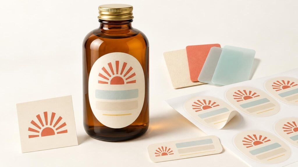
Learning how to create branded labels from a business logo starts with the package, not the design software. Your logo supplies the visual identity, but the container’s usable space, the information customers need, and the way you will apply each label determine whether the finished piece works.
The practical process is to measure the package, choose a suitable label shape, build a readable layout around the logo, prepare the file at its final physical size, and inspect the digital proof as a production checkpoint. This approach works for jars, bottles, boxes, pouches, mailers, bags, and other small-business packaging.
Start with the package and application workflow
First decide whether you need packaging labels or promotional stickers. A label is usually part of a repeat packaging workflow: it identifies a product, communicates essential details, or seals a container. Individual stickers make more sense as handouts, merchandise, event giveaways, or package inserts. The artwork may be similar, but the delivery format and application method are different.
Consider how many packages you label at a time. Roll labels can make repeated application easier because labels stay organized on a continuous liner. Individual pieces may be suitable for occasional use, while sticker sheets can work when each order needs several different designs. If you are unsure, compare roll labels and sticker sheets for product packaging before building the artwork.
Also identify the application surface and environment. Glass, coated boxes, flexible pouches, textured paper, sharply curved bottles, and refrigerated containers present different demands. Verify material, adhesive, and environmental suitability on the specific product page or with the printer rather than assuming every label stock works on every surface.
Measure the usable label area before designing
Measure the area where the label can sit flat and remain visible. Do not treat the package’s total width or height as usable space. Avoid seams, folds, closures, pronounced curves, tapered sections, and areas that flex when the package is opened.
If the package is curved, test several positions. A wide label on a small bottle may cause text near the sides to turn away from the viewer. A narrower front label, or separate front and back labels, can preserve readability.
Choose a shape that supports the information
The logo does not have to dictate the entire label shape. Choose the shape that fits both the package and the content:
- Round labels suit lids, seals, simple marks, and short product names.
- Rectangular labels provide room for longer names, descriptions, ingredients, instructions, or codes.
- Square labels create a balanced front panel for a logo, product name, variant, and compact supporting information. See when square product labels work well for packaging.
- Custom shapes can emphasize a distinctive silhouette, but narrow projections and intricate edges may reduce the usable space for important copy.
A label can echo the logo without tracing every contour. For example, a circular logo can sit comfortably on a rectangular label with the product name and variant arranged beside or beneath it.
Build a complete label around the logo
A logo by itself can work for a bag seal, event handout, or brand sticker. Most product labels need a clearer information hierarchy. Start with the brand mark, then add the product name, variant, quantity or other essential details, and useful contact or website information.
Give each element a job. The brand should be recognizable, the product name should be readable at a glance, and secondary information should remain legible at the actual printed size. Avoid shrinking everything simply to preserve empty space around an oversized logo.
For food, cosmetics, supplements, alcohol, chemicals, and other regulated products, identify the applicable labeling requirements separately. A printer’s artwork proof is not a legal or regulatory review, and requirements can vary by product and jurisdiction.
Prepare the logo file at final print size
Use vector artwork when it is available. AI, SVG, and properly prepared PDF files can preserve crisp edges as a logo is resized. Convert text to outlines or embed the fonts when appropriate so the lettering does not change when another system opens the file.
PNG and JPG files are raster images made from pixels. PNG is useful when the design needs transparency; JPG does not preserve a transparent background. Resolution must be evaluated at the final physical size, not just by looking at the image on a screen.
A practical target for close-viewed printed artwork is 300 pixels per inch at final size, which is consistent with Adobe’s general guidance for high-quality printing. Enlarging a small raster image reduces its effective resolution and does not create genuine detail. Adobe’s print-resolution guidance explains how resolution and print dimensions interact.
For example, placing a small web logo into a much larger label can produce soft lettering or jagged edges even if the file looked sharp online. If no vector file exists, obtain the largest original raster version and assess it at the intended dimensions. The print-ready artwork checklist provides a deeper review of resolution, margins, bleed, and cutlines.
Plan bleed, safe space, and code placement
Bleed is artwork that extends beyond the intended cut edge so a background color or image can print to the edge without an unintended unprinted sliver. Safe space is the buffer between critical content and the cut. Keep logos, small text, borders, and codes comfortably inside the trim rather than placing them directly against it.
Borders deserve extra attention because minor cutting variation can make a narrow border appear uneven. A wider border is generally more forgiving, while a full-bleed background can avoid the issue entirely.
Place barcodes and QR codes early instead of squeezing them into leftover space. GS1 US advises using high-resolution barcode artwork, dark bars on a light background, adequate quiet zones around the symbol, and full-height bars. It also warns against casually resizing supplied barcode artwork. Consult the GS1 US barcode placement and printing guidelines when preparing a retail barcode.
Print the layout at actual size and test any QR code with multiple phones under ordinary lighting. Retail barcodes should be verified through the appropriate barcode-quality process; successful scanning from a screen is not proof that every printed package will scan correctly.
Choose the finish for the intended appearance
Matte and gloss change how the same logo feels. Matte can reduce glare and create a subdued appearance. Gloss can make color and contrast appear more pronounced while producing stronger reflections under direct light. The right choice depends on the artwork, package, lighting, and desired brand character rather than one finish being universally better.
Finish is not the same as label material or adhesive. Before ordering, verify the specific product’s construction and suitability for the package surface and use environment. Specialty or transparent materials may also require white ink beneath selected areas so the logo remains opaque while other areas show the base material.
Treat the proof as a production checkpoint
Review the digital proof at normal viewing size and enlarged for detail. Confirm the final dimensions, shape, cutline, orientation, spelling, product variant, margins, and the position of every code. Check whether transparent areas are intentional and whether any expected white underprint is represented correctly.
Pay particular attention to thin borders, tiny text, low-contrast copy, and content near the edge. Place the proof beside the physical package or compare it with your actual-size mockup. A proof can confirm layout and production intent, but it does not guarantee exact screen-to-print color, specialty-material appearance, adhesion, or barcode performance.
Order the format that matches the job
For recurring product packaging, roll labels are usually the relevant format because they support repeated peeling and application. YouStickers distinguishes packaging-oriented product labels from custom stickers, and its current product-label pages should be checked for available dimensions, quantities, finishes, and ordering terms before purchase.
For giveaways, merchandise, event distribution, or branded inserts, individual custom logo stickers may be the better fit. They can follow the logo’s outline and function independently from the package. Keep these separate from labels carrying product-specific information so a packaging redesign does not make an entire supply of promotional stickers obsolete.
Create the label in the right order
Begin with one real package and one actual-size paper mockup. Once the dimensions and shape work physically, build the information hierarchy, prepare the logo at final size, add bleed and safe space, and test any codes. Only then should you choose the ordering format and approve the proof.
That sequence is the core of how to create branded labels from a business logo: design for the object and workflow rather than treating the logo as a finished label. The result will be easier to read, easier to apply, and less likely to reveal avoidable artwork problems after printing.
