
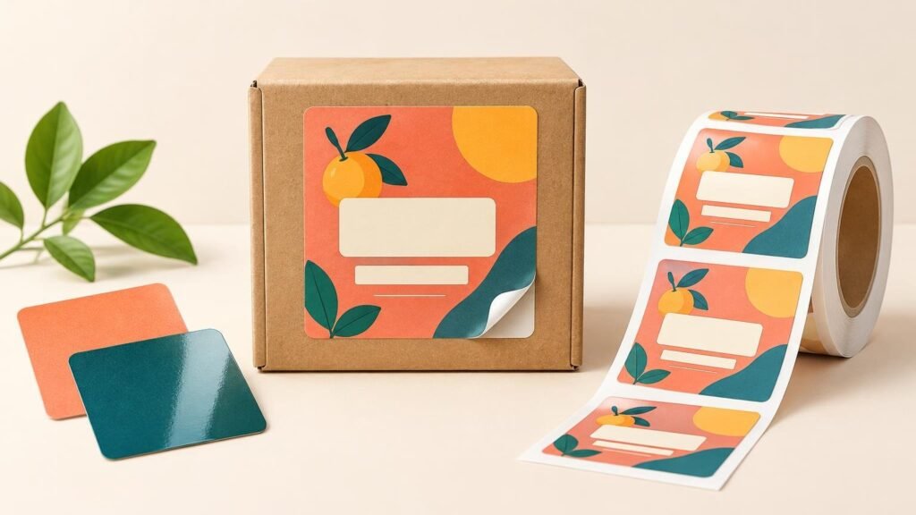
The practical answer to “square product labels when to use them” is straightforward: choose a square when the package has a flat or gently curved area and the design needs a balanced, front-facing layout. Squares are especially effective when a logo, product name, flavor or scent, and a short information block all need comparable visual weight.
The shape is less suitable when the package is narrow, sharply curved, or dominated by long text. Start with package geometry rather than a favorite design template. A square that looks polished on a bakery box may wrinkle around a small bottle or waste space on a slim pouch.
When square product labels work best
Square labels give artwork predictable boundaries. Their equal width and height make it easy to center a logo, stack a product name above a variant, or divide the design into a brand area and a compact supporting-information area. YouStickers presents square roll labels for bags, boxes, jars, bottles, and recurring inventory applications.
Good candidates include candle tins, jar lids, bakery and gift boxes, cartons, flat-front pouches, coffee bags, soap boxes, and packaging seals. On a jar or bottle, the usable panel should be broad enough that the square does not extend deeply around the sides. If viewers must rotate the package to understand the front design, the label is probably too large or too square for that container.
A square also works well when products are organized as a family. A candle maker, for example, can keep the logo and product name in fixed positions while changing the scent name and color accent. That creates consistency without forcing every product name into a narrow horizontal strip.
When another label shape is the better choice
Choose a rectangle when the artwork contains a wide logo, long product name, several lines of required copy, or a horizontal barcode area. Rectangles also fit narrow bottles and side panels more naturally. A tall rectangle can use vertical space on a pouch, while a wide rectangle can span the front of a carton.
Round labels suit centered emblems, lid applications, seals, and designs with minimal copy. They can feel visually softer, but their corners do not provide the same usable text area as a similarly sized square. Oval labels offer a related look with more horizontal room.
A custom die-cut shape makes sense when the silhouette is part of the branding. It can turn a mascot, leaf, badge, or product outline into the label itself. The tradeoff is that irregular contours may leave less room for small copy and require closer attention to cutlines, borders, and safe areas.
| Choose | Best fit | Watch for |
|---|---|---|
| Square label | Balanced front panels, lids, boxes, tins, and pouches | Corners crossing curves or crowding package edges |
| Round label | Lids, seals, badges, and simple centered artwork | Reduced room for long copy |
| Rectangle label | Wide logos, narrow containers, ingredients, or longer text | A layout that looks generic without clear hierarchy |
| Custom shape | Artwork whose silhouette supports the brand | Tight safe areas and visually uneven borders |
Choose the size from the package, not the screen
Measure the usable application panel rather than the package’s total width and height. Exclude seams, folds, ridges, handles, strong curves, and areas customers need to open. On a flexible pouch, fill it before measuring because the front panel can change shape when the product is inside.
Published size examples can provide a starting point: the YouStickers sizing guide discusses approximately 2-inch squares for small jars and 2- to 3-inch labels for some bakery boxes. Those are examples, not universal specifications. Package dimensions, artwork density, and application conditions should determine the final size. See the sticker and label sizing examples
Build the artwork around a clear hierarchy
A square provides room, but it does not automatically create a readable design. Decide what a shopper should notice first, second, and third. Usually that means the brand or product name first, the variant second, and supporting information after that. Trying to make every line equally prominent produces a crowded label even when the physical size is generous.
Keep important text and logos away from the cut edge. Extend background colors or images beyond the trim line as bleed, but keep essential elements inside the safe area specified by the printer. This gives normal cutting variation somewhere to go without clipping a letter or making a border look visibly uneven.
For raster artwork, evaluate resolution at the final physical size. YouStickers recommends 300 DPI at final size, so enlarging a small PNG after upload does not create new detail. Vector AI, SVG, or suitable PDF artwork is usually easier to scale for logos and text. PNG is useful when transparent areas must be preserved, whereas JPG does not support transparency.
Inspect the digital proof as a production checkpoint. Confirm the final dimensions, square orientation, cutline, border consistency, bleed, and distance between critical content and the edge. If the design uses clear or specialty material, verify which areas are intended to remain transparent or reveal the base effect and which need an opaque white underprint.
Treat material and finish as separate decisions
Square describes the cut shape; it does not tell you how a label will behave. The facestock or printable material, adhesive, finish, and optional protective layers are separate production choices. Select them according to the package surface, expected moisture or handling, storage conditions, and desired appearance.
Matte can reduce reflections and support a subdued presentation, while gloss can create a shinier surface and stronger apparent contrast. Clear material can integrate artwork with the package color, but transparent areas may reduce contrast unless the design accounts for the container beneath them. Before ordering, verify the exact material and finish offered for the selected product rather than assuming all square labels share one construction.
For a closer look at one common packaging-label material, see how BOPP labels are used by small businesses. Material choice should still follow the actual surface and environment rather than the label shape alone.
Plan barcode and QR-code areas early
Do not squeeze a barcode into whatever space remains after the branding is finished. Reserve its position at the start, keep it away from trim edges and curvature transitions, and preserve the required blank area around it. GS1 US explains that UPC dimensions depend on the scanning use and printing process, advises against truncating the bars, and requires clear quiet zones at the sides. It also recommends dark bars on a light background and warns against red or reddish bars. Review the GS1 US barcode placement and printing guidance
A square label can hold a barcode, but the shape itself does not improve scanning. Code type, printed dimensions, contrast, quiet zones, surface shape, print quality, and placement all matter. If a UPC is required, follow the applicable GS1 specification and test the printed result in the intended workflow rather than treating the code as a decorative graphic.
Apply similar layout discipline to QR codes: give the code an uncluttered area, avoid folds and strong curves, and test an actual printed sample with multiple devices under realistic lighting. Do not place vital instructions only behind a QR code when customers need them to identify or use the product.
Square roll labels or individual square stickers?
The right delivery format depends on how the pieces will be used. Roll labels are generally the practical choice for recurring packaging work because they can be peeled in sequence and integrated into a repetitive hand-labeling or compatible dispensing workflow. YouStickers lists square, round, rectangle, oval, clear, matte, and gloss options within its broader label selection and positions roll formats for bulk use and faster application.
Individual square stickers make more sense for small product tests, event handouts, order inserts, promotional extras, or situations where each piece is distributed rather than applied at a packing station. If your project moves from package labeling to promotional use, individual custom stickers may provide the more natural format.
Sticker sheets occupy the middle ground when one packing task needs several small designs, such as a logo, care icon, seal, and thank-you sticker. The comparison is mainly about workflow, not artwork quality. For a detailed production decision, see roll labels versus sticker sheets for product packaging.
A practical ordering checklist
- Measure the usable flat or gently curved panel, excluding seams, folds, ridges, and opening areas.
- Make an actual-size paper mockup and test it on a filled or assembled package.
- Confirm that a square supports the artwork better than a rectangle, circle, oval, or custom shape.
- Set the information hierarchy before choosing type sizes.
- Keep important content inside the printer’s safe area and extend backgrounds through the required bleed.
- Reserve barcode or QR-code space before finishing the visual design.
- Choose material, adhesive, and finish for the surface and environment rather than for shape alone.
- Decide whether rolls, sheets, or individual stickers match the application workflow.
- Review final dimensions, cutline, margins, transparency, white-ink intent, and orientation on the proof.
The deciding factor is usable package space
Use a square product label when the package offers enough balanced space for the design to breathe. It is a strong fit for boxes, lids, tins, jars, and flat-front bags where branding and a compact information block need to coexist. Switch to a rectangle for longer copy or narrow panels, a circle for simple centered artwork, or a custom contour when the silhouette carries the design.
Before committing to a run, make an actual-size sample and place it on the real package. That one step is more informative than judging a label on screen: it exposes curvature, crowding, weak contrast, and awkward proportions while those problems are still easy to correct.
