
TLDR
Simple label design ideas for small businesses work best when the label is readable, practical, and consistent with the product.
Use one clear focal point: your logo, product name, flavor, scent, or main benefit.
Choose label shapes and finishes based on the package, not just the design file.
Good labels leave enough white space, use strong contrast, and make important details easy to find.
Simple Label Design Ideas For Small Businesses
A product label has a hard job. It needs to catch attention, explain what the product is, support the brand, and still fit on a jar, bottle, box, pouch, bag, or candle tin. That is a lot to ask from a few square inches.
The good news is that simple label design ideas for small businesses are usually the strongest ones. A clean label with a clear product name, readable text, and a thoughtful layout often looks better than a crowded design trying to say everything at once.
For small businesses, labels are not just decoration. They are part of the buying experience. A customer may see your product on a market table, retail shelf, Instagram post, or shipping box. In each case, the label helps them understand what you sell and whether the product feels worth picking up.
If you need labels for jars, bottles, candles, boxes, food packaging, skincare products, or retail goods, custom labels are a strong place to start because they are made for product packaging and can be ordered in useful shapes, materials, and finishes.
Start With The Product Name
The product name should usually be the easiest thing to read.
That sounds obvious, but it is one of the most common label mistakes. A small business owner may spend so much time on the logo, illustration, pattern, and decorative type that the actual product name becomes hard to find.
For most labels, the visual order should be:
- Brand name or logo
- Product name
- Flavor, scent, style, or variant
- Key details like size, ingredients, use, or warning text
A candle label might read:
Willow & Pine
Lavender Soy Candle
8 oz / Hand Poured
A sauce label might read:
Red Barn Hot Sauce
Smoky Jalapeño
Medium Heat / 5 fl oz
Simple. Clear. Easy to understand.
The customer should not have to study the label to know what they are holding. The design can still have personality, but the basics need to win first.
Use One Main Design Idea
A good label should have one main idea. Not six.
That main idea might be a clean logo, a bold product name, a small illustration, a color block, a hand-drawn icon, or a strong type layout. Pick one. Then let the rest of the design support it.
For example, a small coffee brand could use a simple mountain line drawing above the roast name. A honey brand could use a small bee icon and warm yellow label. A skincare brand could use a soft neutral background with clean serif type. A bakery could use a simple handwritten-style product name with a small wheat icon.
The mistake is combining all of those at once. A script font, a badge shape, an illustration, a texture, a border, a shadow, a pattern, and five colors can make the label feel noisy fast.
A simpler label is usually easier to print, easier to read, and easier to repeat across a full product line.
Choose A Label Shape That Fits The Package
Label shape is part of the design. It should match the container and the amount of information you need to show.
Round labels work well for lids, jars, candles, bakery packaging, seals, and simple front labels. They feel balanced and friendly.
Rectangle labels are better when you need room for product names, ingredients, directions, barcodes, or size details. They are practical for bottles, boxes, bags, pouches, and food packaging.
Oval labels can feel softer than rectangles and work well on jars, candles, bath products, and gift packaging.
Square labels are clean and modern. They work well for boxes, tins, bags, and products with a centered front panel.
Die cut labels are useful when the shape itself supports the brand. A leaf-shaped label for herbal tea, a cloud-shaped label for a baby product, or a custom outline around a logo can feel more personal.
The key is not to choose a shape only because it looks good on a screen. Choose the shape that fits the actual package.
Keep The Font System Simple
Most small business labels only need two fonts.
One font can handle the brand name or product name. The other can handle supporting details. Sometimes one font family with different weights is enough.
A simple font system might look like this:
- Bold sans serif for product names
- Regular sans serif for details
- Small italic or script accent only when needed
Avoid using too many decorative fonts. Script fonts can be nice for candles, baked goods, wedding favors, or handmade products, but they become a problem when they are hard to read. Thin fonts can also disappear on small labels, especially if the print size is tiny or the background has low contrast.
Before finalizing the design, print it at actual size on regular paper. Hold it at arm’s length. If you cannot read the product name quickly, the font is too small, too thin, or too decorative.
Not the most exciting test. Very useful.
Build A Simple Color Palette
Color is one of the easiest ways to make labels feel consistent across a product line.
For most small businesses, two to four brand colors are enough. One main color, one neutral, one accent color, and possibly one variant color for flavor or scent.
A coffee brand might use cream, black, brown, and one color for each roast. A skincare brand might use white, sage, tan, and soft blue. A hot sauce brand might use red, black, white, and orange. A candle brand might use warm neutrals with different accent colors for each scent.
Color can also help customers shop faster. If every flavor, scent, or product type has a different accent color, people can quickly find the version they want.
Just keep contrast in mind. Light gray text on a cream label may look refined in a design file, but it can be hard to read in real life. Dark text on a light background is usually safest for important details.
Use White Space On Purpose
White space is the empty space around your text, logo, and design elements. It does not have to be white. It just means open space.
Small business labels often get crowded because the owner wants to include every selling point: handmade, natural, small batch, local, vegan, eco-friendly, gluten-free, long-lasting, premium, family-owned, and so on.
Some of those details may matter. But they do not all need the same visual weight.
Use white space to make the most important details stand out. Let the product name breathe. Give the logo room. Keep required text grouped neatly instead of scattering it around the label.
A label with fewer elements often looks more polished because the customer can understand it faster.
Try A Clean Badge Layout
Badge-style labels are popular for a reason. They organize information well and work across many product types.
A simple badge layout might include:
- Logo at the top
- Product name in the center
- Small icon or line art
- Size or short description at the bottom
- Border around the label
This works well for candles, coffee bags, soap, honey, sauces, jams, baked goods, and handmade products.
A badge label can be round, oval, square, rectangle, or die cut. The shape does not matter as much as the structure. The main benefit is that the design feels contained and balanced.
Just be careful not to overdo the border, icons, and textures. A badge can look clean, or it can start to look like an old certificate if every detail gets decorated.
Use Minimal Labels For Premium Or Handmade Products
Minimal labels can work well for skincare, candles, wellness products, coffee, tea, ceramics, soaps, and boutique food items.
A minimal label might use:
- Lots of open space
- One strong typeface
- One small logo
- Soft neutral colors
- A matte finish
- Very limited decoration
This style can make the product feel calm and organized. It also works well when the product itself is visually appealing, such as amber bottles, glass jars, kraft bags, or clean white boxes.
The tradeoff is that minimal labels need good spacing and good typography. If the layout is slightly off, there is nowhere to hide. Minimal does not mean unfinished. It means carefully edited.
Use Illustrated Labels For Personality
Illustration can help a small business label feel more personal.
This can be especially useful for food brands, pet products, coffee, sauces, candy, candles, soaps, and local goods. A small strawberry illustration on jam, a simple dog sketch on treats, or a mountain icon on coffee can give the label a clear identity.
Keep illustrations simple enough to reproduce cleanly at label size. Fine details can disappear. Thin lines can fill in. Tiny textures can turn muddy.
If the illustration is the main visual feature, keep the rest of the label quiet. Use a simple font and a limited color palette so the artwork has room to work.
Make Product Lines Easy To Recognize
If your small business sells multiple products, design the labels as a family.
This does not mean every label should be identical. It means they should clearly belong together.
Keep these elements consistent:
- Logo placement
- Product name placement
- Font system
- Label shape
- Border style
- Information hierarchy
- General color palette
Then change one or two things for each product. That might be the accent color, flavor name, scent name, illustration, or background pattern.
For example, a candle brand could use the same layout for every label, but change the scent name and color. A sauce brand could use the same bottle label format, but change the pepper illustration and heat level. A coffee brand could keep the same bag label and change the roast color.
Consistency makes the brand feel more established, even if the business is still small.
Pick The Right Finish For The Brand
The label finish changes how the design feels in real life.
Matte labels tend to feel softer and more understated. They are a good fit for candles, skincare, handmade goods, wellness products, coffee, tea, and natural products.
Glossy labels can make colors look more vibrant. They are useful for bright packaging, food products, drinks, kids’ products, and designs that benefit from shine.
Clear labels work well when you want the container or product color to show through. They are common for bottles, jars, cosmetics, and clean packaging designs. Clear labels can look polished, but they also make dust, bubbles, and surface imperfections more visible.
For many small businesses, the best finish is the one that matches the product experience. A calm lavender candle may look better with matte. A bright fruit drink may look better with gloss. A clear glass jar of honey may look better with a transparent label.
Add Practical Details Without Crowding The Label
A label often needs more than a logo and product name. It may need size, ingredients, scent, flavor, directions, batch number, barcode, warning text, website, or social handle.
The trick is to separate marketing details from practical details.
The front label should usually focus on what helps the customer understand the product quickly. The back or side label can carry the dense information.
For simple front labels, include:
- Brand name
- Product name
- Variant, flavor, or scent
- Size or quantity if needed
- One short supporting detail
For secondary labels, include:
- Ingredients
- Directions
- Warnings
- Barcode
- Business information
- Website
- Batch or lot details
This is where custom labels are useful because labels are built for packaging, not just decoration. For product packaging, jars, bottles, boxes, and retail goods, custom labels can help small businesses create labels that look clean and apply consistently.
Simple Label Design Ideas By Business Type
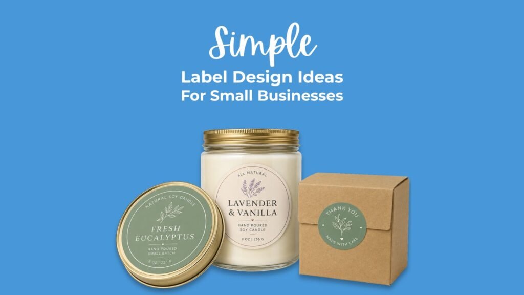
For candle brands, use warm neutrals, scent-focused names, and a label finish that matches the product. Round labels work well on lids. Rectangle or oval labels work well on jars.
For food brands, make the product name and flavor easy to read. Use color coding for flavors. Leave room for ingredients, net weight, and other required details when needed.
For skincare brands, keep the layout clean and avoid overloading the front label. Product type, scent, skin type, and size should be easy to find.
For coffee and tea brands, use a consistent label system across blends. Change the accent color or illustration for each roast, blend, or flavor.
For handmade soap brands, simple paper-style or matte labels can work well. Make the scent and ingredient story clear, but do not crowd the front.
For ecommerce brands, labels can help boxes, bags, and mailers feel finished. A simple logo label, thank-you label, or product ID label can make packaging more organized without a full custom box.
Common Label Design Mistakes To Avoid
The biggest mistake is trying to make the label do too much. A small label cannot carry the whole brand story, every benefit, every ingredient, every certification, and every design idea at once.
Another common mistake is designing without checking the real size. A label that looks beautiful at 600% zoom may be unreadable when printed at two inches wide.
Also avoid weak contrast. The label may look soft and elegant on a bright screen, but customers see products in kitchens, bathrooms, shops, markets, and shipping boxes. Readability matters.
A few mistakes to watch for:
- Too many fonts
- Too many colors
- Text that is too small
- Low contrast
- Crowded edges
- No clear focal point
- Unclear product name
- Label shape that does not fit the package
- Design that changes too much across product variants
The label should make the product easier to understand. If the design makes the customer work harder, simplify it.
Conclusion
Simple label design ideas for small businesses usually come back to the same principle: make the product easy to understand and easy to trust.
A good label does not need to be complicated. It needs clear hierarchy, readable text, a fitting shape, enough white space, and a design system you can repeat. That is what makes packaging feel consistent from product to product.
Start with the product name. Choose one main design idea. Pick a label shape that fits the container. Use color, typography, and finish to support the brand rather than distract from it.
Small businesses do not need labels that look busy. They need labels that look intentional.
FAQs
What should a small business label include?
A small business label should usually include the brand name, product name, variant or flavor, size, and any important product information. Depending on the product, it may also need ingredients, directions, warnings, barcode, or business details.
What is the best label shape for product packaging?
The best label shape depends on the package. Round labels work well for lids, candles, and jars. Rectangle labels work well for bottles, bags, boxes, and products that need more text. Custom die cut labels are useful when the shape supports the brand.
How many fonts should I use on a product label?
Most labels only need one or two fonts. Use one font for the main product name or logo area and one simple font for supporting details. Too many fonts can make the label harder to read.
Are matte or glossy labels better for small businesses?
Matte labels often work well for candles, skincare, natural products, and handmade goods. Glossy labels can work well for bright food, beverage, and retail packaging. The better choice depends on the brand style and product use.
How do I make my labels look more professional?
Use clear hierarchy, strong contrast, consistent fonts, enough white space, and a label size that fits the package. Print a test at actual size before ordering a full batch.
Should small businesses use labels or stickers for packaging?
Labels are usually better for packaging because they are made to stay on jars, bottles, boxes, bags, and retail goods. Stickers are better for giveaways, merch, inserts, and promotional use.
References
YouStickers, Custom Labels Product Page
YouStickers, Custom Stickers and Labels Homepage
YouStickers, Custom Stickers vs Custom Labels: Which One Should You Order?
Intent Sentence
This post helps small business owners create better product labels by explaining simple design ideas, layout choices, label shapes, finishes, and common mistakes, so they can make packaging that looks clear and ready to sell.
SEO Pack
SEO Focus Keyphrase:
Simple label design ideas for small businesses
SEO Title:
Simple Label Design Ideas For Small Businesses
Meta Description:
Simple label design ideas for small businesses that help products look clear, polished, and ready to sell on jars, boxes, bottles, and bags.
Slug:
simple-label-design-ideas-small-businesses
Excerpt:
Simple labels can make small business packaging look cleaner and easier to understand. Use these label design ideas for jars, bottles, boxes, candles, food products, and more.
SEO Tags:
label design, small business labels, product labels, custom labels, packaging design, label ideas, YouStickers
