
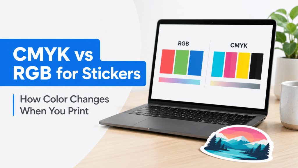
TLDR
- For YouStickers orders, customers should usually upload RGB artwork if the design was originally created in RGB.
- Do not run your file through a random RGB-to-CMYK converter before uploading. A bad conversion can dull colors, shift values, flatten gradients, or throw away useful color data.
- Our software can interpret RGB files, and our printers have a wider color gamut than traditional CMYK-only printing.
- Some bright screen colors can still shift when printed because screens create color with light, while stickers reproduce color with ink on material.
- The best file is usually the cleanest original artwork: high resolution, correctly sized, and saved in a common format like PNG, PDF, SVG, AI, or JPG.
CMYK vs RGB for stickers can be confusing because a lot of print advice online says, “Always convert to CMYK before printing.” That advice may make sense for some offset print workflows, but it is not always the best advice for custom sticker printing.
For YouStickers, the better rule is: if your artwork was designed in RGB, usually submit it in RGB. Our software can interpret RGB artwork, and our printers are not limited to a basic CMYK-only color range. A random online CMYK converter may actually make your sticker colors worse before we ever see the file.
What Is RGB?
RGB stands for red, green, and blue. It is the color model used by screens, including phones, laptops, tablets, cameras, and most design apps.
Adobe explains that RGB reproduces color by mixing red, green, and blue light at different intensities. In common 8-bit RGB files, each channel ranges from 0 to 255. That is why digital color values often look like R: 35, G: 120, B: 240. (Adobe’s color model guide)
RGB is light-based. That means colors on a screen can look extremely bright, especially blues, greens, reds, pinks, and neon-style colors. Your monitor is glowing. A sticker is not.
What Is CMYK?
CMYK stands for cyan, magenta, yellow, and black. It is a traditional process-printing color model based on ink. Adobe describes CMYK as a subtractive model where inks absorb part of the visible spectrum and reflect the remaining color back to your eye. (Adobe’s CMYK overview)
In older or more traditional print workflows, CMYK was often treated as the default “print mode.” That made sense for many four-color offset printing jobs, where a press was literally separating the artwork into cyan, magenta, yellow, and black plates.
Sticker printing can be different. Modern digital print workflows can use color management software, printer profiles, expanded ink sets, and printer-specific conversion. That means a customer-side CMYK conversion is not always the best path.
Why YouStickers Usually Recommends RGB Uploads
If your design was created in RGB, it is usually better to upload the original RGB file instead of converting it yourself.
Here is why:
- RGB preserves more of the original digital color information.
- Our software can interpret RGB files.
- Our printers have a wider gamut than traditional CMYK-only printing.
- A random converter may use the wrong CMYK profile.
- CMYK conversion can permanently change color values.
- Once bright colors are clipped or dulled, some information may not be recoverable.
Adobe’s Photoshop documentation warns that converting from RGB to CMYK remaps out-of-gamut RGB colors into the CMYK working space, and that some details may not be recoverable. Adobe also recommends doing most edits in the original color mode to preserve flexibility. (Adobe Photoshop color conversion guide)
That is exactly why we do not want customers to run artwork through a random converter just because they heard “print equals CMYK.” If the design started as RGB, a poor conversion can limit what our production workflow has to work with.
Why Colors Still Change When Stickers Print
Even with a strong print workflow, printed stickers will not always match a glowing screen exactly. That is normal.
A screen produces color with light. A sticker reflects light off ink, laminate, and material. The same color can look different depending on the monitor, phone brightness, room lighting, sticker material, laminate, and background surface.
Adobe’s color management guide explains that each device operates within a specific color space, or gamut, and that colors can shift when documents move between devices, software, print media, and viewing environments. (Adobe color management guide)
For stickers, color can be affected by:
- the original file
- the color profile
- the print material
- matte vs gloss laminate
- white vinyl vs clear material
- lighting where the sticker is viewed
- whether the color is very bright or saturated
- whether the customer’s screen is unusually bright or color-enhanced
A bright electric blue on a phone may look slightly different on printed vinyl. A neon green may print less neon than it looks on screen. A soft pastel may look different under warm indoor light than it does on a calibrated monitor.
RGB vs CMYK for Stickers: Quick Comparison
| Question | RGB | CMYK |
|---|---|---|
| Best for screen design? | Yes | Usually no |
| Common for photos and digital art? | Yes | Not usually |
| Can preserve bright digital colors? | Often better | More limited in many workflows |
| Best upload choice for YouStickers if art started in RGB? | Usually yes | Usually no |
| Can random conversion cause dull color? | Not applicable | Yes |
| Useful for traditional offset print workflows? | Sometimes converted later | Yes, when using the right profile |
| Should customers convert just because “printing uses CMYK”? | No | No |
The key is not “RGB is always better” or “CMYK is always better.” The key is using the right workflow for the printer, material, and file.
For YouStickers, that usually means sending us the original RGB artwork instead of guessing at a CMYK conversion.
What “Wider Gamut Than CMYK” Means
A color gamut is the range of colors a device or printing system can reproduce. Traditional CMYK process printing has a defined range, but modern digital printers can sometimes reproduce colors outside a basic CMYK expectation, especially when they use expanded ink sets, advanced color management, or printer-specific profiles.
For example, Epson describes some professional printers as using expanded ink sets with wide or extreme color gamuts, including 10-color and 11-color systems with gamut-expanding inks. (Epson SureColor S-Series information) Canon also describes its large-format LUCIA PRO ink technology as expanding color gamut for graphic art printing. (Canon large-format inkjet technology overview)
That does not mean every screen color can be printed exactly. It does mean that a simple “convert everything to generic CMYK” rule can be too limiting for modern digital print workflows.
When CMYK Files Are Still Okay
CMYK files are not bad. They are just not always necessary.
A CMYK file can be fine when:
- the artwork was professionally designed in CMYK from the start
- the designer used the correct color profile intentionally
- the brand has approved CMYK values
- the file is coming from a professional print designer
- the artwork is simple and not dependent on bright RGB colors
- the customer understands the likely print result
Adobe notes that CMYK mode is used when preparing an image to be printed using process colors, and that CMYK ranges can vary depending on press and printing conditions. (Adobe Photoshop color modes guide)
The important part is intent. A carefully prepared CMYK file from a designer is different from an RGB logo dragged into a free converter five minutes before ordering.
When RGB Is the Better Choice
RGB is usually the better upload choice when:
- the artwork was created in Procreate, Canva, Photoshop, Illustrator, Figma, or another digital tool in RGB
- the file is a photo
- the colors are bright or saturated
- the design includes gradients
- the customer is not sure which CMYK profile to use
- the file is a PNG or JPG made for digital use
- the customer is tempted to use an online converter
In those cases, send the original file. Let the print workflow interpret the color instead of forcing the file into a generic CMYK space.
This is especially important for colorful stickers, illustrated designs, creator merch, anime-style artwork, gaming stickers, event stickers, brand mascots, and artwork with bright blues, greens, pinks, oranges, or purples.
Do Not Use Random Online Color Converters
A random RGB-to-CMYK converter may sound helpful, but it can create problems.
It may:
- use the wrong CMYK profile
- flatten transparency
- change blacks
- dull bright colors
- shift brand colors
- damage gradients
- reduce saturation
- compress the file
- remove embedded profiles
- convert text or vectors poorly
A converter does not know the printer, material, laminate, ink set, or production workflow. It is guessing. That guess can limit the color before the file reaches the print system.
If your artwork started in RGB and you do not have a specific reason to convert it, leave it in RGB.
Colors Most Likely to Shift
Some colors are harder to print exactly than others.
Colors most likely to shift include:
- neon green
- electric blue
- bright cyan
- hot pink
- intense purple
- fluorescent orange
- very saturated red
- screen-glow gradients
- colors made brighter by phone display settings
These colors may still print beautifully, but they may not look exactly like the backlit screen version. This is not a sticker defect. It is the difference between light on a screen and ink on a surface.
Material and Finish Also Affect Color
Color is not only about RGB and CMYK. Sticker material and finish matter too.
White vinyl gives the most predictable color because the artwork prints over a white base. Clear stickers can look great, but the surface behind the sticker affects the final appearance. A design that looks bright on a white screen may become harder to read on tinted glass, dark bottles, or colored packaging.
Gloss laminate can make colors feel brighter and more saturated. Matte laminate can reduce glare and create a softer look. Neither is automatically better. Gloss is often stronger for bold colorful artwork, while matte is often better for clean branding, small text, and lower-glare designs.
For most first-time sticker orders, white vinyl with either matte or gloss laminate is the safest way to keep colors readable.
Best File Setup for Sticker Color
For best color results, focus on file quality first.
Use this checklist before uploading:
- Upload the original RGB file if the design was created in RGB.
- Avoid random RGB-to-CMYK converters.
- Use high-resolution artwork at the final sticker size.
- Use vector files for logos, text, icons, and simple shapes when possible.
- Use PNG when you need transparency.
- Use PDF, SVG, or AI for clean vector artwork when available.
- Use JPG only when transparency is not needed.
- Keep an editable backup of your original file.
- Avoid screenshots when possible.
- Make sure small text has enough contrast.
- Use white vinyl when color accuracy and readability matter most.
- Review your proof carefully before approval.
YouStickers’ quality standards recommend vector formats such as PDF, SVG, and AI for logos and crisp text, and 300 DPI at final print size for raster artwork. The same page recommends keeping important details inside safe margins and outlining or embedding fonts when possible. (YouStickers quality standards)
Practical Recommendation
For most YouStickers customers, the best choice is simple: submit the cleanest original file in the color mode it was designed in. If your artwork was created in RGB, keep it in RGB. Do not convert it to CMYK unless you know exactly why you are doing it and which profile your printer needs.
This gives our software and printers more useful color information to work with. It also helps avoid dull, flattened, or incorrectly converted files.
If color is critical, review the proof carefully and remember that screen color is only a preview. Stickers are physical objects, so the final color will always be influenced by ink, material, laminate, lighting, and the surface where the sticker is applied.
Common Mistakes to Avoid
Do not convert RGB artwork to CMYK with a random online tool.
Do not assume a dull CMYK preview is “more accurate” for every sticker printer.
Do not use screenshots for color-critical artwork.
Do not judge print color from a phone at maximum brightness.
Do not expect neon screen colors to print like actual fluorescent ink unless a specialty process is being used.
Do not use clear stickers when the design needs a white base for readable color.
Do not ignore the difference between matte and gloss laminate.
Do not flatten a professional file unless you have saved an editable backup.
Do not approve a proof without checking color, spelling, size, and readability.
FAQs
Should I submit sticker artwork in RGB or CMYK?
For YouStickers, submit RGB if your artwork was originally created in RGB. Our software can interpret RGB files, and our printers have a wider gamut than traditional CMYK-only printing.
Is CMYK bad for sticker printing?
No, CMYK is not bad. A properly prepared CMYK file can print well. The issue is random or unnecessary conversion. If your artwork started in RGB, converting it to generic CMYK before uploading can make the colors worse.
Why do printed sticker colors look different from my screen?
Screens use light, while stickers use ink on physical material. Color can shift because of the screen, printer, material, laminate, lighting, and color profile. Adobe notes that devices and media have different color spaces, which can cause color changes between capture, display, and output. (Adobe color management guide)
Will neon colors print exactly?
Usually not. Bright neon-style screen colors are often outside what standard print materials can reproduce exactly. They may still print bright and attractive, but they may look less glowing than they do on a screen.
Should I convert Canva or Procreate artwork to CMYK?
Usually no. If the artwork was created in RGB, keep the original RGB file unless you have a specific professional reason to convert it. A random converter can damage the file or shift the colors.
What is the safest material for predictable sticker color?
White vinyl is usually the safest material for predictable color because it gives the artwork a white base. Clear stickers, holographic materials, and specialty finishes can look great, but they make the material part of the color result.
