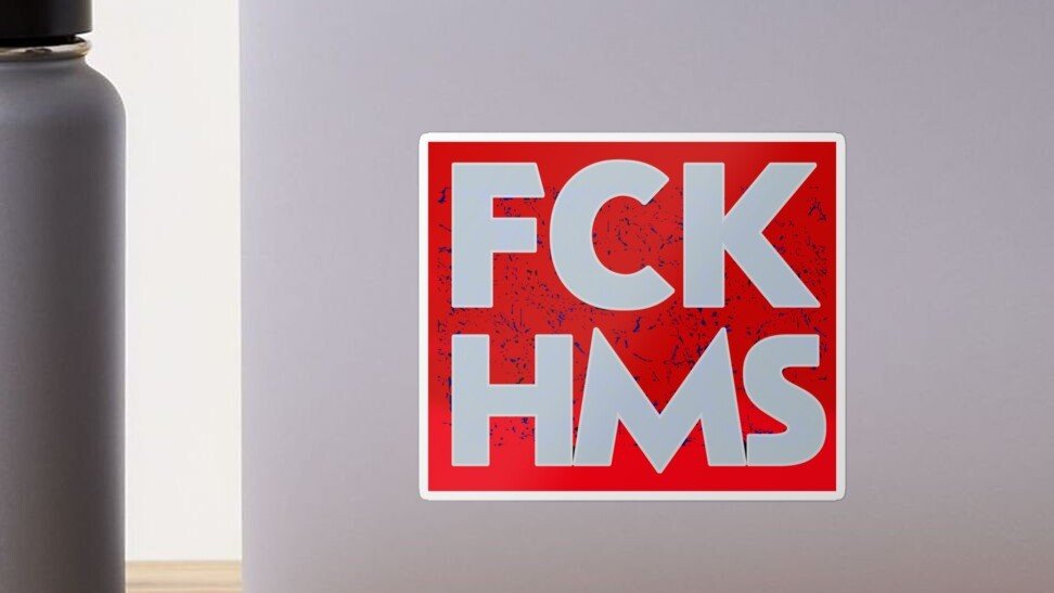
A custom FCK HMS sticker is really two jobs at once. First, it has to carry a message. Second, it has to work as an actual sticker, which is where a lot of people go sideways. The design might look fine on a screen, then print too dark, too small, too busy, or just awkward once it lands on a laptop, bottle, notebook, or car window. That part gets annoying fast.
The good news is that this is not complicated once you break it down. You do not need a giant art background or some overbuilt process. You need a readable message, the right size, the right material, and a file that will print clean. After that, the rest is mostly choosing how polished you want the final result to feel.
Plan The Message First
Start with the message, not the effects.
For a slogan sticker like this, readability matters more than anything else. People should be able to understand it in one quick look. That means bold text, clean spacing, and strong contrast. Tiny text on a political sticker is basically a weird way to make sure nobody reads it.
A few practical rules help:
- Keep the phrase short and central
- Use one strong font, maybe two at most
- Avoid clutter around the text
- Add one graphic element only if it helps the design read faster
- Test the design small before you commit
In my opinion, the strongest version is usually simple. A clear wordmark, a solid background choice, maybe a border, and done. You are not designing a movie poster. You are designing something that has to survive quick glances, scratched surfaces, and real lighting.
Choose The Right Size For Where It Will Go
Before you customize your own FCK HMS sticker, decide where it will actually live. That decision changes almost everything.
Here is a simple starting point:
| Use Case | Good Starting Size | Best Starting Approach |
|---|---|---|
| Laptop, notebook, water bottle | 3 inches | Bold text, white vinyl, die cut |
| Phone case, smaller item | 2 to 2.5 inches | Very simple layout, thick lettering |
| Car window, cooler, larger gear | 4 to 5 inches | Strong contrast, slightly thicker border |
For most people, 3 inches is the safest starting point. Big enough to read, small enough to fit almost anywhere, and not so large that it starts feeling like a bumper sticker by accident.
And if your design has extra detail, go up a size. Thin strokes and little decorative elements disappear fast on smaller stickers. That is just how it goes.
Choosing Materials For A Custom FCK HMS Sticker
Material choice matters more than most people expect.
For a custom FCK HMS sticker, white vinyl is usually the safest pick. It gives you solid opacity, better contrast, and a more predictable result across different surfaces. On a laptop, bottle, or toolbox, white vinyl usually reads better and causes fewer surprises.
Clear stickers can work, but only when the surface underneath helps the design. That means smooth, light, and fairly clean backgrounds. On dark or busy surfaces, clear can make your artwork harder to read. This is especially true when the design depends on strong white elements.
Then there is finish.
Matte works well when you want less glare and a more understated look. Gloss works well when you want color to pop more. Neither is magic. It mostly comes down to the vibe you want and where the sticker will be used.
My default advice is simple:
- Choose white vinyl for most slogan stickers
- Choose matte when glare is a concern
- Choose gloss when you want stronger visual punch
- Choose clear only when the transparent effect is part of the idea
Decide Between Die Cut And Kiss Cut
This is one of those print terms that sounds technical until you actually hold the sticker.
A die cut sticker is cut all the way through the sticker and the backing, so the whole piece follows your shape exactly. It looks clean and finished. It is great for handouts, merch, and individual stickers.
A kiss cut sticker leaves extra backing around the sticker. The sticker itself peels away from that backing. That makes it easier to handle and easier to peel, which is honestly a bigger deal than people realize.
For a message sticker like this, the decision is pretty straightforward:
- Choose die cut when you want the final shape to feel polished and standalone
- Choose kiss cut when easy peeling matters more, or when the shape is detailed
YouStickers also has a good breakdown in The Difference Between Die Cut and Kiss Cut Stickers if you want the longer version.
Use Borders And Contrast The Smart Way
A lot of customization comes down to contrast.
You can change the font, color palette, finish, cut style, and border treatment, but contrast is what decides whether the design works in real life. I would rather see a plain sticker with strong contrast than a flashy one that disappears on the surface.
A white border is often the easiest fix. It helps the design pop on mixed backgrounds and gives the cutter a forgiving edge. Full bleed can look sharper and more modern, but it needs better setup and a little more care.
Good contrast choices include:
- Black text on white
- White text on black
- White text on a strong single color
- Dark lettering with a white outline
Less reliable choices include low-contrast tone-on-tone palettes, thin outlines, or clear stock with tiny light text. Those can look cool in a mockup and weak in person.
Prep The File So It Prints Clean
This is the part nobody wants to think about, right up until the sticker comes out fuzzy.
Your file should match the final print size as closely as possible. High resolution matters. Vector files are great for text-heavy designs because they stay crisp. A transparent PNG also works well when the artwork is already sized correctly.
A solid print-ready setup looks like this:
- Build at final size, or very close to it
- Use high-resolution artwork
- Keep important text away from the edge
- Convert text to outlines when possible
- Use CMYK-friendly colors for more predictable print results
When you are making a sheet of multiple designs, leave some breathing room between them. Cramming everything together may look efficient on screen, but it gets messy fast when cutting starts.
And when you want to go deeper on the setup side, How to Make Custom Stickers at Home or Online is worth reading.
Ordering Through YouStickers
Once the design is ready, the actual process is pretty simple.
You upload the artwork, review the proof, approve it, and then production moves forward. That proof step matters. Use it. Zoom in. Check the text. Check the border. Check whether your spacing still feels balanced. This is the moment to catch the small stuff before it turns into a stack of stickers you wish looked different.
One thing I like here is that YouStickers keeps the process practical. You can upload common file types, choose your size and quantity, and get a free online proof before production starts. You also do not need to create the cutline yourself unless you really want that extra control. For most designs, letting the production team handle the cut path is the easier move.
That makes customization easier in a real-world way. You are not stuck doing every technical step yourself just to get a clean result.
DIY Or Professionally Printed
You can absolutely test ideas at home. That is a good move when you are trying layouts, checking text size, or deciding between color options.
But home-made stickers and professionally printed stickers are not really the same product.
At home, you are usually working with basic printable stock, basic cuts, and less durable finishes. That is fine for concept testing or one-off use. Once you want clean edges, better durability, stronger laminate protection, or a batch that looks consistent, professional printing is the better path.
A good way to use both approaches is this:
- Mock up a few versions at home
- Tape them to the actual surface
- Step back and see what reads best
- Upload the winner for a proof and final print
That little test catches a lot. A design that feels huge on your monitor can look surprisingly tiny on a real bottle or laptop.
Common Mistakes To Avoid
Most failed slogan stickers die from the same few mistakes.
The usual suspects are:
- too much text
- low contrast
- thin fonts
- details that are too small
- clear stock on a bad background
- shapes with fragile little points
- skipping the proof review
The funniest one, in a painful way, is when someone makes a bold message sticker and then chooses a font that looks like it belongs on a wedding invitation. Not every font needs to feel aggressive, but it does need to feel intentional.
Final Thoughts
Creating a custom FCK HMS sticker does not need to be complicated. Keep the message readable. Pick a size based on where it will go. Use white vinyl unless you have a clear reason not to. Choose die cut or kiss cut based on how you want it to feel in the hand. And make sure the file is clean before you upload it.
That is really the whole game.
A strong custom FCK HMS sticker is not about packing in more effects or making it louder than it needs to be. It is about clarity. When the message reads fast and the sticker itself looks clean, the design does its job.

